Python 数据可视化 生成数据
1. 数据分析和数据可视化概念
-
数据分析:而数据分析指的是使用代码来探索数据集的规律和关联。数据集可以是用一行代码就能表示的小型数字列表,也可以是数千兆字节的数据
-
目的:
漂亮地呈现数据并非仅仅关乎漂亮的图片。通过以引人注目的简单方式呈现数据,能让观看者明白其含义:发现数据集中原本未知的规律和意义。
数据可视化工具 -
数据科学家使用Python编写了一系列优秀的可视化和分析工具,其中很多可供你使用。最流行的工具之一是Matplotlib,它是一个数学绘图库,我们将使用它来制作简单的图表,如折线图和散点图。
-
安装Matpotlib
pip3 install --user sphinx
注意: 版本要使用3.5.3 版本,如果版本太高,代码需要改写。
1.1. 绘制简单的折线图
一个简单的例子
mpl_squares.py
import  matplotlib.pyplot as plt
squares = [1, 4, 9, 16, 25]
fig, ax = plt.subplots()
ax.plot(squares)
plt.show()
1.2. 绘图的组成部分
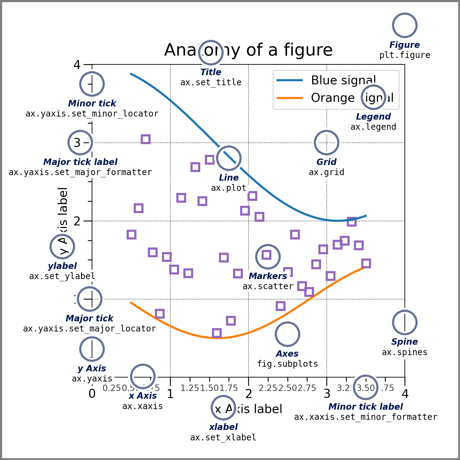
1.2.1. Figure
| 结构 | 说明 |
|---|---|
| Figure | 整个绘图区域,可以包含多个坐标轴, |
- 可以包括(标题,图形图例,颜色条等,甚至可以嵌套子绘图区域)。
fig = plt.figure()  # an empty figure with no Axes
fig, ax = plt.subplots()  # a figure with a single Axes
fig, axs = plt.subplots(2, 2)  # a figure with a 2x2 grid of Axes
1.2.2. Axes
| 结构 | 说明 |
|---|---|
| Axes | 是在绘图区域中设置的坐标轴,如果是三维图像,则是三个坐标轴, |
- 为坐标轴中的数据提供刻度和刻度标签。
- Axes 还有一个标题(通过set_title() 设置)
- 一个x 标签(通过set_xlabel()设置)
- 一个y标签(通过set_ylabel()设置)
1.2.3. Axis
| 结构 | 说明 |
|---|---|
| Axis | 设置坐标轴的刻度和标签。 |
1.2.4. Artist
| 结构 | 说明 |
|---|---|
| Artist | 基本上所有的可见的元素的都成为Artist 。 |
- Artist 包括 :
Figure ,Axes ,Axis ,Text ,Line2D, Collections ,Path 等对象。 - 当这些元素被渲染时,所有的Artist 都会被绘制在 Figure 上。
- 大多数Artis 会被花在同一个坐标轴中,但是如果Artist 不符合当前坐标轴规范,则会被绘制到另外的坐标轴上。
1.3. Matpotlib 函数
1.3.1. subplot 函数
首先导入模块pyplot ,并为其指定别名plt ,以免反复输入pyplot 。
matplotlib.pyplot.subplots(_nrows=1_, _ncols=1_, _*_, _sharex=False_, _sharey=False_, _squeeze=True_, _width_ratios=None_, _height_ratios=None_, _subplot_kw=None_, _gridspec_kw=None_, _**fig_kw_)[[source]](https://github.com/matplotlib/matplotlib/blob/v3.6.0/lib/matplotlib/pyplot.py#L1284-L1435)
- 创建一个图和一组子图 。
- 这个函数可以方便的创建figure 的布局。
1.3.1.1. 入参
| 参数 | 说明 |
|---|---|
| nrows | 将figure 分割上下成几份。 |
| ncols | 将figure 分割成左右几份。 |
| sharex, sharey | X 轴和 Y 轴是否共享属性 |
| width_ratios | 定义X轴的刻度的相对宽度 |
| height_ratios | 定义Y轴的刻度的相对高度。 |
| **fig_kw | 将定义好的子图返回给figure 调用 |
1.3.1.2. 返回值
| 值 | 说明 |
|---|---|
| fig | figure |
| ax | 返回的坐标轴 |
# using the variable ax for single a Axes
fig, ax = plt.subplots()

# using the variable axs for multiple Axes
fig, axs = plt.subplots(2, 2)

# using tuple unpacking for multiple Axes
fig, (ax1, ax2) = plt.subplots(1, 2)
fig, ((ax1, ax2), (ax3, ax4)) = plt.subplots(2, 2)
2. 修改标签文字和线条粗细
mpl_squares.py
# 导入matplotlib库
import matplotlib.pyplot as plt
#设置字体 ,如果不设置字体,则汉字无法显示
plt.rcParams["font.sans-serif"]=["SimHei"]
#该语句解决图像中的“-”负号的乱码问题
plt.rcParams["axes.unicode_minus"]=False
# 创建一个列表
squares = [1, 4, 9, 16, 25]
# 创建一个figure 并附带一个坐标轴
fig, ax = plt.subplots()
# 在坐标轴中绘制图形,并设置线段为3
ax.plot(squares, linewidth=3)
# 设置坐标轴的标题为"平方数“,字体大小为24
ax.set_title("平方数", fontsize=24)
# 设置X 坐标轴的标签为"值",字体大小为24
ax.set_xlabel("值", fontsize=14)
# 设置Y 坐标轴的标签为"平方值",字体大小为24
ax.set_ylabel("平方值", fontsize=14)
# 设置刻度标记的大小。
ax.tick_params(axis='both', labelsize=14)
plt.show()
如果想要在matolotlib 中使用汉字,需要设置对应字体。否则显式不出来汉字。
2.1. 使用到的函数
2.1.1. plot()
plot(*args, scalex=True, scaley=True, data=None, **kwargs)
说明:
主要是在坐标轴中绘制图形。
详情参考matplotlib.pyplot.plot — Matplotlib 3.6.0 documentation
2.1.2. tick_params()
tick_params(axis='both', **kwargs)
说明:
设置X,Y 坐标上的刻度大小和样式
2.2. 校正图形
mpl_squares.py
import matplotlib.pyplot as plt
plt.rcParams["font.sans-serif"]=["SimHei"] #设置字体
plt.rcParams["axes.unicode_minus"]=False #该语句解决图像中的“-”负号的乱码问题
imput_values = [1, 2, 3, 4, 5]
squares = [1, 4, 9, 16, 25]
fig, ax = plt.subplots()
ax.plot(imput_values, squares, linewidth=3)
ax.set_title("平方数", fontsize=24)
ax.set_xlabel("值", fontsize=14)
ax.set_ylabel("平方值", fontsize=14)
ax.tick_params(axis='both', labelsize=14)
plt.show()
2.3. 图表的内置样式
mpl_squares.py
import matplotlib.pyplot as plt
plt.style.use('tableau-colorblind10')

plt.rcParams["font.sans-serif"]=["SimHei"] #设置字体
plt.rcParams["axes.unicode_minus"]=False #该语句解决图像中的“-”负号的乱码问题
input_values = [1, 2, 3, 4, 5]
squares = [1, 4, 9, 16, 25]
fig, ax = plt.subplots()
ax.plot(input_values, squares, linewidth=3)
ax.set_title("平方数", fontsize=24)
ax.set_xlabel("值", fontsize=14)
ax.set_ylabel("平方值", fontsize=14)
ax.tick_params(axis='both', labelsize=14)
plt.show()
注意: plt.style.use('fivethirtyeight') 必须放在最前面,否则字体设置会被覆盖,会造成中文无法显示。
2.3.1. 内置样式
# 显示所有样式
print(plt.style.available)
['Solarize_Light2', '_classic_test_patch', '_mpl-gallery', '_mpl-gallery-nogrid', 'bmh', 'classic', 'dark_background', 'fast', 'fivethirtyeight', 'ggplot', 'grayscale', 'seaborn', 'seaborn-bright', 'seaborn-colorblind', 'seaborn-dark', 'seaborn-dark-palette', 'seaborn-darkgrid', 'seaborn-deep', 'seaborn-muted', 'seaborn-notebook', 'seaborn-paper', 'seaborn-pastel', 'seaborn-poster', 'seaborn-talk', 'seaborn-ticks', 'seaborn-white', 'seaborn-whitegrid', 'tableau-colorblind10']
内置样式表
| 样式 | 图底色 | 边框底色 | 网格 | 线 | 备注 |
|---|---|---|---|---|---|
| seaborn-dark | 灰色 | 白色 | 无网格 | 蓝色 | |
| seaborn-darkgrid | 灰色 | 白色 | 白色网格 | 蓝色 | |
| seaborn-ticks | 白色 | 白色 | 无网格 | 蓝色 | |
| fivethirtyeight | 白色 | 白色 | 白色网格 | 蓝色 | |
| Solarize_Light2 | 黄色 | 黄色 | 白色网格 | 蓝色 | |
| _classic_test_patch | 白色 | 白色 | 无网格 | 蓝色 | |
| _mpl-gallery | 白色 | 白色 | 有网格 | 蓝色 | 只有图像没有坐标 |
| _mpl-gallery-nogrid | 白色 | 白色 | 无网格 | 蓝色 | 只有图像没有坐标 |
| bmh | 灰色, | 白色 | 灰网格 | 蓝色 | |
| classic | 白底 | 灰色 | 无网格 | 蓝色 | |
| dark_background | 黑色 | 黑色 | 无网格 | 蓝色 | |
| fast | 白色 | 白色 | 无网格 | 蓝色 | 默认模式 |
| ggplot | 灰色 | 白色 | 白色网格 | 红色 | |
| grayscale | 白色 | 灰色 | 无网格 | 黑色 | |
| seaborn | 灰色 | 白色 | 白色网格 | 蓝色 | |
| seaborn-bright | 白色 | 白色 | 无网格 | 蓝色 | 默认格式 |
| seaborn-colorblind | 白色 | 白色 | 无网格 | 蓝色 | |
| seaborn-dark-palette | 同上 | 同上 | 同上 | 同上 | |
| seaborn-deep | ·· | ·· | ·· | ·· | ·· |
| seaborn-muted | ·· | ·· | ·· | ·· | ·· |
| seaborn-notebook | .. | .. | .. | .. | .. |
| seaborn-paper | ·· | ·· | ·· | ·· | ·· |
| seaborn-pastel | 浅蓝色 | ||||
| seaborn-poster | ·· | ·· | ·· | ·· | 小号字体 |
| seaborn-talk | ·· | ·· | ·· | ·· | 小号字体 |
| tableau-colorblind10 | ·· | ·· | ·· | ·· | ·· |
2.4. 使用scatter() 绘制散点图并设置样式
catter_squares.py
import matplotlib.pyplot as plt
plt.style.use('seaborn')
fig, ax = plt.subplots()
# 显示一个点
ax.scatter(2, 4)
plt.show()
函数:

matplotlib.pyplot.scatter(x, y, s=None, c=None, marker=None, cmap=None, norm=None, vmin=None, vmax=None, alpha=None, linewidths=None, verts=None, edgecolors=None, _, data=None,_ *kwargs)
## 参数说明

x, y : 相同长度的数组,数组大小(n,),也就是绘制散点图的数据;

s:绘制点的大小,可以是实数或大小为(n,)的数组, 可选的参数 ;

c:绘制点颜色, 默认是蓝色'b' , 可选的参数 ;

marker:表示的是标记的样式,默认的是'o' , 可选的参数 ;

cmap:当c是一个浮点数数组的时候才使用, 可选的参数 ;

norm:将数据亮度转化到0-1之间,只有c是一个浮点数的数组的时候才使用, 可选的参数 ;

vmin , vmax:实数,当norm存在的时候忽略。用来进行亮度数据的归一化 , 可选的参数 ;

alpha:实数,0-1之间, 可选的参数 ;

linewidths:标记点的长度, 可选的参数 ;
catter_squares.py
import matplotlib.pyplot as plt
plt.style.use('seaborn')
plt.rcParams["font.sans-serif"]=["SimHei"] #设置字体
plt.rcParams["axes.unicode_minus"]=False #该语句解决图像中的“-”负号的乱码问题
fig, ax = plt.subplots()
# s 选项为点的大小
ax.scatter(2, 4, s=200)
# 设置图表标题并给坐标轴加上标签。
ax.set_title("平方数", fontsize=34)
ax.set_xlabel("值", fontsize=24)
ax.set_ylabel("值的平方", fontsize =24)

# 设置刻度标记的大小。
ax.tick_params(axis='both', which='major', labelsize=14)

plt.show()
plt.style.use('seaborn') 加在所有代码的最前面,不要覆盖字体设置代码。
2.5. 使用scatter() 绘制一系列点
catter_squares.py
import matplotlib.pyplot as plt

x_values = [1, 2, 3, 4, 5]
y_values = [1, 4, 9, 16, 25]

plt.style.use('seaborn')
plt.rcParams["font.sans-serif"] = ["SimHei"]  # 设置字体
plt.rcParams["axes.unicode_minus"] = False  # 该语句解决图像中的“-”负号的乱码问题
fig, ax = plt.subplots()
ax.scatter(x_values, y_values, s=100)
# 设置图表标题并给坐标轴加上标签。
ax.set_title("平方数", fontsize=34)
ax.set_xlabel("值", fontsize=24)
ax.set_ylabel("值的平方", fontsize=24)

# 设置刻度标记的大小。
ax.tick_params(axis='both', which='major', labelsize=14)

plt.show()
2.6. 自动计算数据
import matplotlib.pyplot as plt

x_values = range(1, 1001)
y_values = [x**2 for x in x_values]

plt.style.use('seaborn')
plt.rcParams["font.sans-serif"] = ["SimHei"]  # 设置字体
plt.rcParams["axes.unicode_minus"] = False  # 该语句解决图像中的“-”负号的乱码问题
fig, ax = plt.subplots()
ax.scatter(x_values, y_values, s=10)
# 设置图表标题并给坐标轴加上标签。
ax.set_title("平方数", fontsize=34)
ax.set_xlabel("值", fontsize=24)
ax.set_ylabel("值的平方", fontsize=24)

# 设置刻度标记的大小。
ax.tick_params(axis='both', which='major', labelsize=14)
# 关闭科学计数法
ax.ticklabel_format(style='plain', axis="y")
# 开启科学计数法
# ax.ticklabel_format(style='sci', axis="y")

# 设置每个坐标轴的取值范围。
ax.axis([0, 1100, 0, 1100000])

plt.show()
科学计数法的 参考文章:Python matplotlib 坐标轴采用科学计数法 - 简书 (jianshu.com)
2.7. 自定义颜色
ax.scatter(x_values, y_values, c='red', s=10)
2.8. 渐变颜色
ax.scatter(x_values, y_values, c=y_values ,cmap=plt.cm.Blues, s=10)
在官网还有很多颜色映射 颜色映射
2.9. 自动保存图表
plt.savefig('squraes_plot.png', bbox_inches='tight')
2.10. 练习题
练习15-1:立方 数的三次方称为立方 。请绘制一个图形,显示前5个整数的立方值。再绘制一个图形,显示前5000个整数的立方值
import matplotlib.pyplot as plt

x_values = range(1, 5000)
y_values = [x**3 for x in x_values]

plt.style.use('seaborn')
plt.rcParams["font.sans-serif"] = ["SimHei"]  # 设置字体
plt.rcParams["axes.unicode_minus"] = False  # 该语句解决图像中的“-”负号的乱码问题
fig, ax = plt.subplots()
ax.scatter(x_values, y_values, c=y_values ,cmap=plt.cm.Pastel1, s=10)
# 设置图表标题并给坐标轴加上标签。
ax.set_title("立方数", fontsize=24)
ax.set_xlabel("值", fontsize=24)
ax.set_ylabel("值的平方", fontsize=24)

# 设置刻度标记的大小。
ax.tick_params(axis='both', which='major', labelsize=14)
# 关闭科学计数法
ax.ticklabel_format(style='plain', axis="y")
# 开启科学计数法
#ax.ticklabel_format(style='sci', axis="y")

# 设置每个坐标轴的取值范围。
ax.axis([0, 1100, 0, 1100000])

plt.savefig('squraes_plot.png', bbox_inches='tight')
3. 随机漫步
3.1. 创建RandomWalk 类
random_walk.py
from random import choice


class RandomWalk:
    """一个生成随机漫步数据的类。"""

    def __init__(self, num_points=5000):
        """Initialize random walk properties. """
        self.num_points = num_points
        # 所有随机漫步都始于(0,0).
        self.x_values = [0]
        self.y_values = [0]

    def fill_walk(self):
        """Compute all points contained in the random walk. """
        # 不断漫步,直到列表达到指定长度。
        while len(self.x_values) < self.num_points:
            # 决定前进方向以及沿这个方向前进的距离。
            x_direction = choice([1, -1])
            x_distance = choice([0, 1, 2, 3, 4])
            x_step = x_direction * x_distance

            y_direction = choice([1, -1])
            y_distance = choice([0, 1, 2, 3, 4])
            y_step = y_direction * y_distance
            # 拒绝原地踏步
            if x_step == 0 and y_step == 0:
                continue
            # 计算下一个点的x值和y值。
            x = self.x_values[-1] + x_step
            y = self.y_values[-1] + y_step

            self.x_values.append(x)
            self.y_values.append(y)
import matplotlib.pyplot as plt
from random_walk import RandomWalk
# 创建一个RandomWalk实例。
rw = RandomWalk()
rw.fill_walk()
# 将所有的点都绘制出来。
plt.style.use('classic')
fig, ax = plt.subplots()
ax.scatter(rw.x_values ,rw.y_values, s=15)
plt.show()
3.2. 设置随机漫步图的样式
3.2.1. 渐变色
import matplotlib.pyplot as plt
from random_walk import RandomWalk
# 创建一个RandomWalk实例。
while True:
    rw = RandomWalk()
    rw.fill_walk()
    # 将所有的点都绘制出来。
    plt.style.use('classic')
    fig, ax = plt.subplots()
    point_numbers = range(rw.num_points)
    ax.scatter(rw.x_values ,rw.y_values, c=point_numbers, cmap=plt.cm.Blues, edgecolor='none', s=15)
    plt.show()

    keep_running = input("Make another walk?(y/n):")
    if keep_running == 'n':
        break
3.2.2. 重新绘制起点和终点
import matplotlib.pyplot as plt
from random_walk import RandomWalk
# 创建一个RandomWalk实例。
while True:
    rw = RandomWalk()
    rw.fill_walk()
    # 将所有的点都绘制出来。
    plt.style.use('classic')
    fig, ax = plt.subplots()
    point_numbers = range(rw.num_points)
    ax.scatter(rw.x_values ,rw.y_values, c=point_numbers, cmap=plt.cm.Blues, edgecolor='none', s=15)
    # 突出七点和终点。
    ax.scatter(0, 0, c='red', edgecolor='none', s=100)
    ax.scatter(rw.x_values[-1], rw.y_values[-1], c='red', edgecolor='none', s=100)
    plt.show()

    keep_running = input("Make another walk?(y/n):")
    if keep_running == 'n':
        break
3.2.3. 隐藏坐标轴
import matplotlib.pyplot as plt
from random_walk import RandomWalk
# 创建一个RandomWalk实例。
while True:
    rw = RandomWalk()
    rw.fill_walk()
    # 将所有的点都绘制出来。
    plt.style.use('classic')
    fig, ax = plt.subplots()
    point_numbers = range(rw.num_points)
    ax.scatter(rw.x_values ,rw.y_values, c=point_numbers, cmap=plt.cm.Blues, edgecolor='none', s=15)
    # 突出起点和终点。
    ax.scatter(0, 0, c='red', edgecolor='none', s=100)
    ax.scatter(rw.x_values[-1], rw.y_values[-1], c='red', edgecolor='none', s=100)
    # 隐藏坐标轴。
    ax.get_xaxis().set_visible(False)
    ax.get_yaxis().set_visible(False)

    plt.show()

    keep_running = input("Make another walk?(y/n):")
    if keep_running == 'n':
        break
3.2.4. 增加随机漫步的点数
import matplotlib.pyplot as plt
from random_walk import RandomWalk
# 创建一个RandomWalk实例。
while True:
    rw = RandomWalk(50000)
    rw.fill_walk()
    # 将所有的点都绘制出来。
    plt.style.use('classic')
    fig, ax = plt.subplots()
    point_numbers = range(rw.num_points)
    ax.scatter(rw.x_values ,rw.y_values, c=point_numbers, cmap=plt.cm.Blues, edgecolor='none', s=15)
    # 突出起点和终点。
    ax.scatter(0, 0, c='red', edgecolor='none', s=100)
    ax.scatter(rw.x_values[-1], rw.y_values[-1], c='red', edgecolor='none', s=100)
    # 隐藏坐标轴。
    ax.get_xaxis().set_visible(False)
    ax.get_yaxis().set_visible(False)

    plt.show()

    keep_running = input("Make another walk?(y/n):")
    if keep_running == 'n':
        break
3.2.5. 调整尺寸以适合屏幕
fig, ax = plt.subplots(figsize=(15, 9),dpi=128)
1 英寸= 2.54 厘米。
dpi=128 ,表示每英寸的像素为128 像素。
4. 使用Plotly 模拟掷子
需要创建在浏览器中显示的图表时,Plotly很有用,因为它生成的图表将自动缩放以适合观看者的屏幕
Plotly生成的图表还是交互式的:用户将鼠标指向特定元素时,将突出显示有关该元素的信息。
4.1. 安装Plotly
python -m pip install --user plotly
4.2. 创建Die 类
from random import randint

class Die:
   """ Denotes the class of a die. """

   def __init__(self, num_sides=6):
       """ The default is 6 sides."""
       self.num_sides = num_sides

   def roll(self):
       """ Returns a random value between 1 and the number of faces on the die."""
       return randint(1, self.num_sides)
4.3. 掷骰子
die_visual.py
from Die import Die
die = Die()
# Roll the dice several times and store the results in a list.
results = []
for roll_num in range(100):
    result = die.roll()
    results.append(result)
print(results)
4.4. 分析结果
from Die import Die
die = Die()
# Roll the dice several times and store the results in a list.
results = []
for roll_num in range(100):
    result = die.roll()
    results.append(result)
print(results)
frequencies = []
for value in range(1, die.num_sides + 1):
    """ Counts the number of times the current value appears in the list."""
    frequency = results.count(value)
    """ Adds the number of occurrences to the list."""
    frequencies.append(frequency)
print(frequencies)
4.5. 绘制直方图
from plotly.graph_objs import Bar, Layout
from plotly import offline

from Die import Die

die = Die()
# Roll the dice several times and store the results in a list.
results = []
for roll_num in range(1000):
    result = die.roll()
    results.append(result)
print(results)
frequencies = []
for value in range(1, die.num_sides + 1):
    """ Counts the number of times the current value appears in the list."""
    frequency = results.count(value)
    """ Adds the number of occurrences to the list."""
    frequencies.append(frequency)
print(frequencies)
# Visualize the results.
# 创建列表,list 是把对应reange 函数转换成列表。
x_values = list(range(1, die.num_sides + 1))
# 绘制条形图的数据集
data = [Bar(x=x_values, y=frequencies)]
# 设置坐标轴标签
x_axis_config = {'title': '结果'}
y_axis_config = {'title': '结果的频率'}
# 创建图表的布局和配置的对象,这事设置了图表名称,并传入了x 和y轴的配置字典。
my_layout = Layout(title='掷一个D61000次结果', xaxis=x_axis_config, yaxis=y_axis_config)
# 将对应的data 和 布局对象的字典 写入到 对应的文件中。
offline.plot({'data': data, 'layout': my_layout}, filename='d6.html')
[Bar({
'x': [1, 2, 3, 4, 5, 6], 'y': [174, 144, 179, 158, 183, 162]
})]
4.6. 同时掷两个骰子
from plotly.graph_objs import Bar, Layout
from plotly import offline

from Die import Die

die1 = Die()
die2 = Die()
# Roll the dice several times and store the results in a list.
results = []
# 掷两个骰子 并算出两个累加和。
for roll_num in range(1000):
    result = die1.roll() + die2.roll()
    results.append(result)
frequencies = []
max_result = die1.num_sides + die2.num_sides
# 注意这里是从2 开始, 到13 , 因为两个骰子最小累加和为2 .
# 统计每个数据的出现频率。
for value in range(2, max_result + 1):
    """ Counts the number of times the current value appears in the list."""
    frequency = results.count(value)
    """ Adds the number of occurrences to the list."""
    frequencies.append(frequency)
print(frequencies)
# Visualize the results.
#  创建x轴的列表,list 是把对应range 函数转换成列表。
x_values = list(range(2, max_result + 1))
# 创建图表数据集
data = [Bar(x=x_values, y=frequencies)]
print(data)
# 设置x轴样式, ditck 设置的是x轴显示所有刻度值。
x_axis_config = {'title': '结果','dtick': 1}
y_axis_config = {'title': '结果的频率'}
my_layout = Layout(title='掷两个D61000次结果', xaxis=x_axis_config, yaxis=y_axis_config)
offline.plot({'data': data, 'layout': my_layout}, filename='d6.html')
4.7. 练习题
练习15-7:同时掷三个骰子 同时掷三个D6时,可能得到的最小点数为3,最大点数为18。请通过可视化展示同时掷三个D6的结果
from plotly.graph_objs import Bar, Layout
from plotly import offline

from Die import Die

die1 = Die(6)
die2 = Die(6)
die3 = Die(6)
# Roll the dice several times and store the results in a list.
results = []
for roll_num in range(1000):
    result = die1.roll() + die2.roll() + die3.roll()
    results.append(result)
frequencies = []
max_result = die1.num_sides + die2.num_sides + die3.num_sides
for value in range(3, max_result + 1):
    """ Counts the number of times the current value appears in the list."""
    frequency = results.count(value)
    """ Adds the number of occurrences to the list."""
    frequencies.append(frequency)
print(frequencies)
# Visualize the results.
x_values = list(range(3, max_result + 1))
data = [Bar(x=x_values, y=frequencies)]
print(data)

x_axis_config = {'title': '结果', 'dtick': 1}
y_axis_config = {'title': '结果的频率'}
my_layout = Layout(title='掷三个D6 1000次结果', xaxis=x_axis_config, yaxis=y_axis_config)
offline.plot({'data': data, 'layout': my_layout}, filename='d6.html')
练习15-8:将点数相乘 同时掷两个骰子时,通常将其点数相加。请通过可视化展示将两个骰子的点数相乘的结果。
from plotly.graph_objs import Bar, Layout
from plotly import offline

from Die import Die

die1 = Die(6)
die2 = Die(6)
# Roll the dice several times and store the results in a list.
results = []
for roll_num in range(1000):
    result = die1.roll() * die2.roll()
    results.append(result)
frequencies = []
max_result = die1.num_sides * die2.num_sides
for value in range(1, max_result + 1):
    """ Counts the number of times the current value appears in the list."""
    frequency = results.count(value)
    """ Adds the number of occurrences to the list."""
    frequencies.append(frequency)
print(frequencies)
# Visualize the results.
x_values = list(range(1, max_result + 1))
data = [Bar(x=x_values, y=frequencies)]
print(data)

x_axis_config = {'title': '结果', 'dtick': 1}
y_axis_config = {'title': '结果的频率'}
my_layout = Layout(title='掷两个D6 1000次相乘结果', xaxis=x_axis_config, yaxis=y_axis_config)
offline.plot({'data': data, 'layout': my_layout}, filename='d6.html')
练习15-10 使用两个库 :尝试使用Matplotlib通过可视化来模拟掷骰子的情况,并尝试使用Plotly通过可视化来模拟随机漫步的情况。要完成这个练习,需要查看这些库的文档。
from random import randint


class Die:
    """ Denotes the class of a die. """

    def __init__(self, num_sides=6):
        """ The default is 6 sides."""
        self.num_sides = num_sides
        self.x_values = [0]
        self.y_values = [0]

    def roll(self):
        """ Returns a random value between 1 and the number of faces on the die."""
        return randint(1, self.num_sides)
from random import choice
from Die import  Die


class RandomWalk:
    """一个生成随机漫步数据的类。"""

    def __init__(self,num_points=5000):
        """Initialize random walk properties. """
        self.die = Die(12)
        self.num_points = num_points
        # 所有随机漫步都始于(0,0).
        self.x_values = [0]
        self.y_values = [0]

    def fill_walk(self):
        """Compute all points contained in the random walk. """
        # 不断漫步,直到列表达到指定长度。
        while len(self.x_values) < self.num_points:
            # 决定前进方向以及沿这个方向前进的距离。
            x_direction = choice([1])
            x_distance = self.die.roll()
            x_step = x_direction * x_distance

            y_direction = choice([1])
            y_distance = self.die.roll()
            y_step = y_direction * y_distance
            # 拒绝原地踏步
            if x_step == 0 and y_step == 0:
                continue
            # 计算下一个点的x值和y值。
            x = self.x_values[-1] + x_step
            y = self.y_values[-1] + y_step

            self.x_values.append(x)
            self.y_values.append(y)
rw_visual.py
import matplotlib.pyplot as plt
from randomwalk import RandomWalk
# 创建一个RandomWalk实例。
while True:
    rw = RandomWalk(50000)
    rw.fill_walk()
    # 将所有的点都绘制出来。
    plt.style.use('classic')
    fig, ax = plt.subplots()
    point_numbers = range(rw.num_points)
    ax.scatter(rw.x_values ,rw.y_values, c=point_numbers, cmap=plt.cm.Blues, edgecolor='none', s=15)
    # 突出起点和终点。
    ax.scatter(0, 0, c='red', edgecolor='none', s=100)
    ax.scatter(rw.x_values[-1], rw.y_values[-1], c='red', edgecolor='none', s=100)
    # 隐藏坐标轴。
    ax.get_xaxis().set_visible(False)
    ax.get_yaxis().set_visible(False)

    plt.show()

    keep_running = input("Make another walk?(y/n):")
    if keep_running == 'n':
        break